
SaaS landing pages that explain the supported workflow
David A · Founder, 1212 Agency
Published November 16, 2026

Review a SaaS campaign page from query to confirmed request. Check product evidence, qualification, mobile behavior and demo handoff before sending more traffic.
A SaaS landing page should help the intended buyer understand whether the product can do the job they searched for. A polished hero cannot compensate for an unclear capability, an unsupported integration claim or a request that disappears after submission.
Use a specific campaign and product workflow for the review. The example below is fictional: a scheduling product supports resource-based reservations, while a campaign reaches operators comparing multi-room booking tools. The wireframe and copy are illustrations, not a claim about an existing client product.
Keep the page tied to one buying question
Write the search or campaign promise at the top of the brief. The fictional visitor wants to know whether separate rooms can have their own availability. A general headline such as run your business better does not answer that question.
A more useful illustrative headline is manage availability for each bookable room. The supporting sentence should describe only verified behavior: for example, create a schedule for each room and review reservations in the supported calendar view. If the product does not support shared staff conflicts or a particular payment flow, the page should not imply that it does.
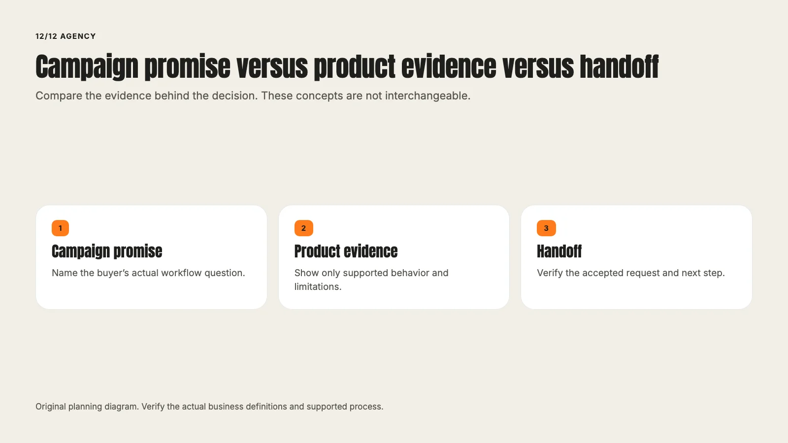
The query establishes a reader need. Product evidence establishes what can be promised. Neither should be inferred from the other.
Show the workflow before expanding the claim
A simple original diagram could show rooms, their availability and the reservation confirmation. It should make the supported relationship visible. A screenshot can add evidence if it comes from the current product and contains no private customer information.
The diagram should not quietly introduce features. A two-way synchronization arrow implies a specific capability. A payment icon can imply a checkout integration. If those details are not verified, remove them or label the illustration precisely.
Ask product to review the page while the design can still change. A late approval request focused only on spelling may miss a misleading workflow.
Use a page structure that supports the decision
For the fictional page, the first screen could contain the workflow headline, a short fit statement, one accurate visual and a request-a-demo action. The next section could explain the steps and limits. A third could answer evaluation questions such as setup requirements, supported roles and what the demonstration covers.
Useful proof belongs near the claim it supports. A verified customer result needs its period, definition and permission. If no cleared result exists, use product evidence and a concrete explanation rather than inventing a testimonial.
The page should also make the next action understandable. Requesting a demo may submit a form, open a calendar or ask the team to follow up. Those are different experiences, and the button should not promise an instant booking if the system only sends a request.
Qualify without collecting unnecessary information
Ask which fields the team needs to route and prepare the conversation. For the example, business type and number of bookable rooms might be useful. A field that nobody uses adds friction without improving the handoff.
Explain why the requested information is relevant. Keep privacy and consent text accurate for the actual destination and follow-up process. Do not request sensitive personal information simply because a CRM field exists.
Review what happens when the form rejects an entry. Errors should identify the field and the correction without wiping the rest of the work. A required field that becomes invisible on a small screen is a defect to repair, not a conversion hypothesis.
Follow the request through the handoff
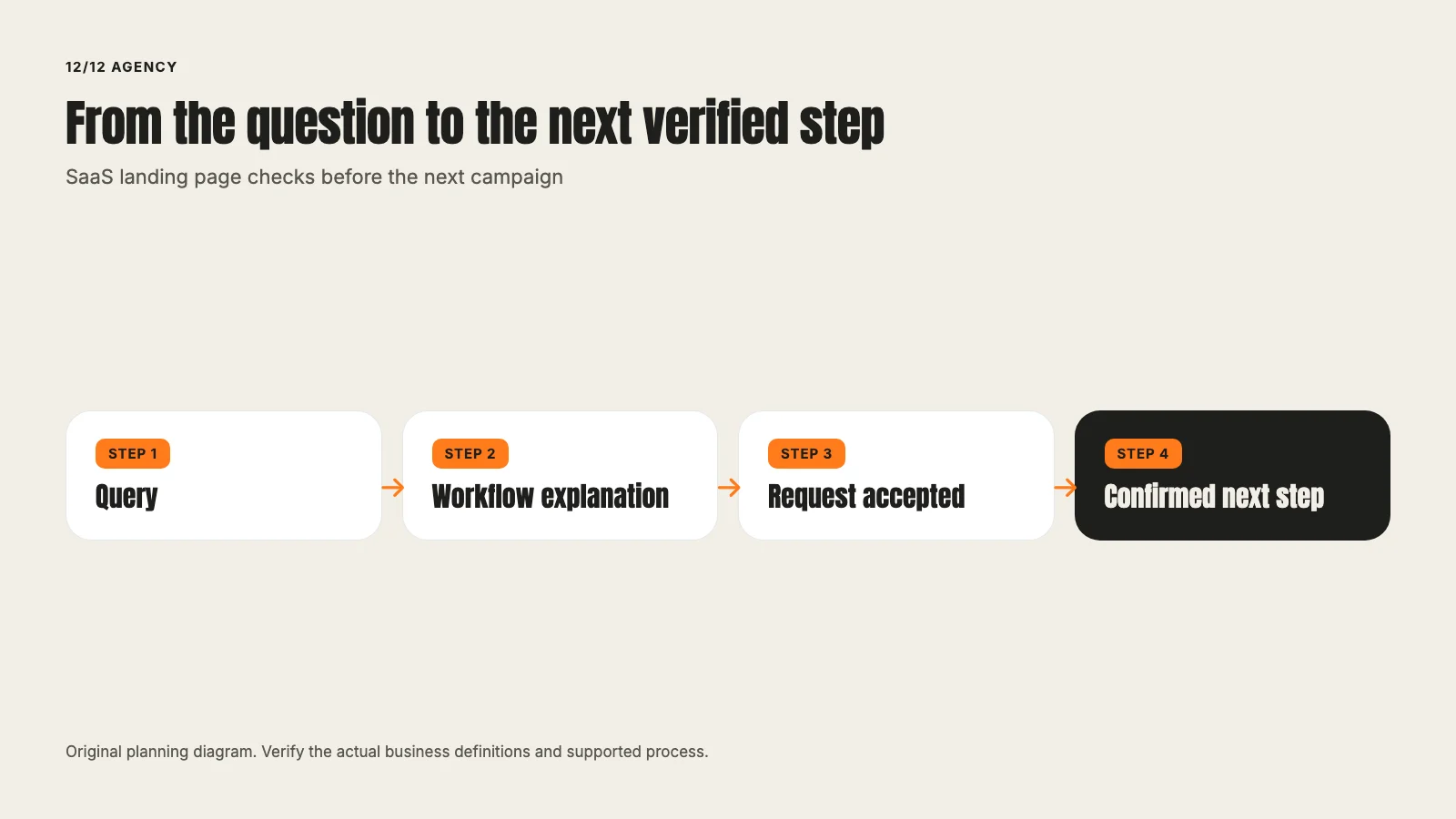
Check form acceptance, confirmation, calendar or routing, event delivery and the relevant CRM record. A button click alone does not prove that the request was accepted. A contact record alone does not prove that a meeting was booked.
Use one approved labeled test where a real submission is necessary. Agree on any notification or appointment consequences beforehand. Keep the test identity visible and exclude it from business reporting. Do not create repeated requests because a dashboard has not refreshed.
Our existing conversion-tracking guide covers the broader measurement contract. This page review should use that contract rather than reproduce an entire tag-setup tutorial.
Check campaign information across the real path
A campaign can land on the correct page and lose its parameters on the next link. Inspect the actual destination and submitted request through the supported route. Preserve meaningful destination settings and follow the site's consent behavior.
A clean-looking URL or a successful tag request is narrower evidence than paid attribution. State what was verified: the campaign information survived navigation, the accepted action occurred, or the technical event was sent. Do not combine those into a claim that Google credited a paid result when no eligible ad interaction was tested.
Review the mobile decision, not just the breakpoint
Read the page on a real supported small screen. Can the buyer understand the headline, inspect the product evidence and reach the action? Does a sticky element cover form fields or consent controls? Can the keyboard user reach and operate the same controls?
Inspect the page after an error and after successful completion. Those states are part of the experience. A screenshot of the empty form does not verify the full journey.
Use a measured performance investigation if the page is slow. Distinguish a local lab result from real-user behavior. Do not sacrifice the essential explanation merely to make the top screen shorter.
Decide whether the next change is a repair or a test
A broken form, inaccurate feature statement or missing confirmation needs a correction with an acceptance check. An uncertain choice between two accurate explanations may warrant a planned test.
Define the eligible population, primary outcome, guardrails and review rule before comparing versions. A small difference from a tiny sample is not conclusive. If several changes ship together, describe the result as a combined change rather than attributing it to one headline.
Use a product-evidence review card
Before design approval, give the reviewer the exact headline, workflow visual, implied capability and next action. Ask what a buyer could reasonably infer from each. In the fictional room-booking example, the reviewer should distinguish room availability from staff conflicts, payments and external synchronization. A drawing can accidentally promise all four even when the sentence promises only one.
The SaaS page preserves the commercial fit. The Google Ads and Meta contexts explain why different campaign promises can need different page evidence. The B2B lead-generation guide keeps the later qualification stage visible.
Check the public destination against Google's destination requirements. Use the web.dev form-accessibility guidance when reviewing labels, focus and errors. These are concrete references for delivery and operation, not a formula for a guaranteed conversion rate.
The review receipt should show the actual mobile error and success states as well as the first screen. If a necessary state cannot be verified, name it. A polished wireframe can be approved as a design proposal while still requiring implementation evidence before it is described as a working customer journey.
A final review card
Write down the buyer question, verified product promise, page evidence, necessary fields, accepted action, handoff destination and next review. Assign the human reviewers for product accuracy, design and technical behavior.
Bring the campaign promise and current destination to a landing-page review.
Frequently asked questions
Want this run for your business?
Tell us where to send it and we'll follow up with the strategies that fit your market.