
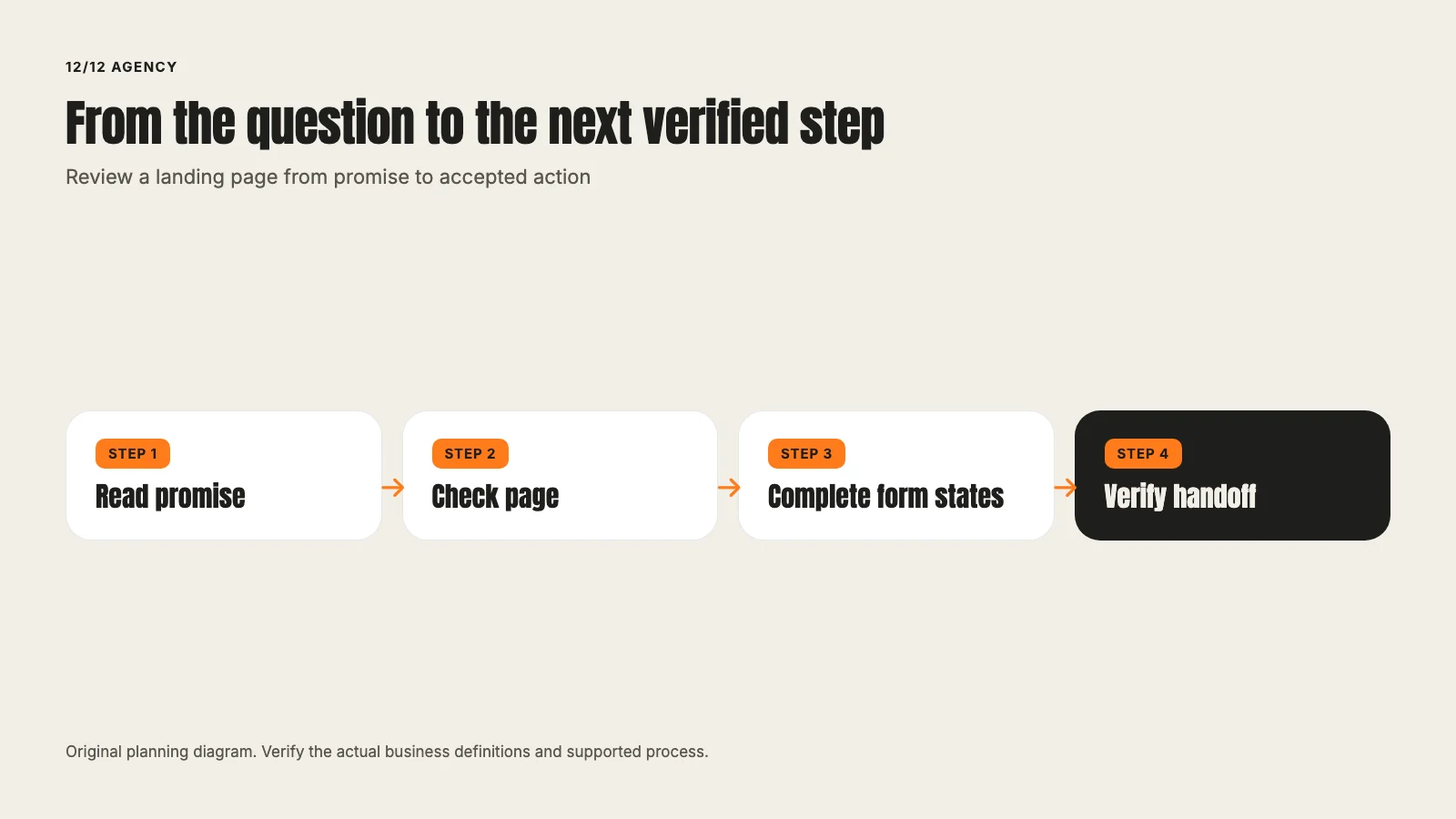
Review a landing page from promise to accepted action
David A · Founder, 1212 Agency
Published November 16, 2026

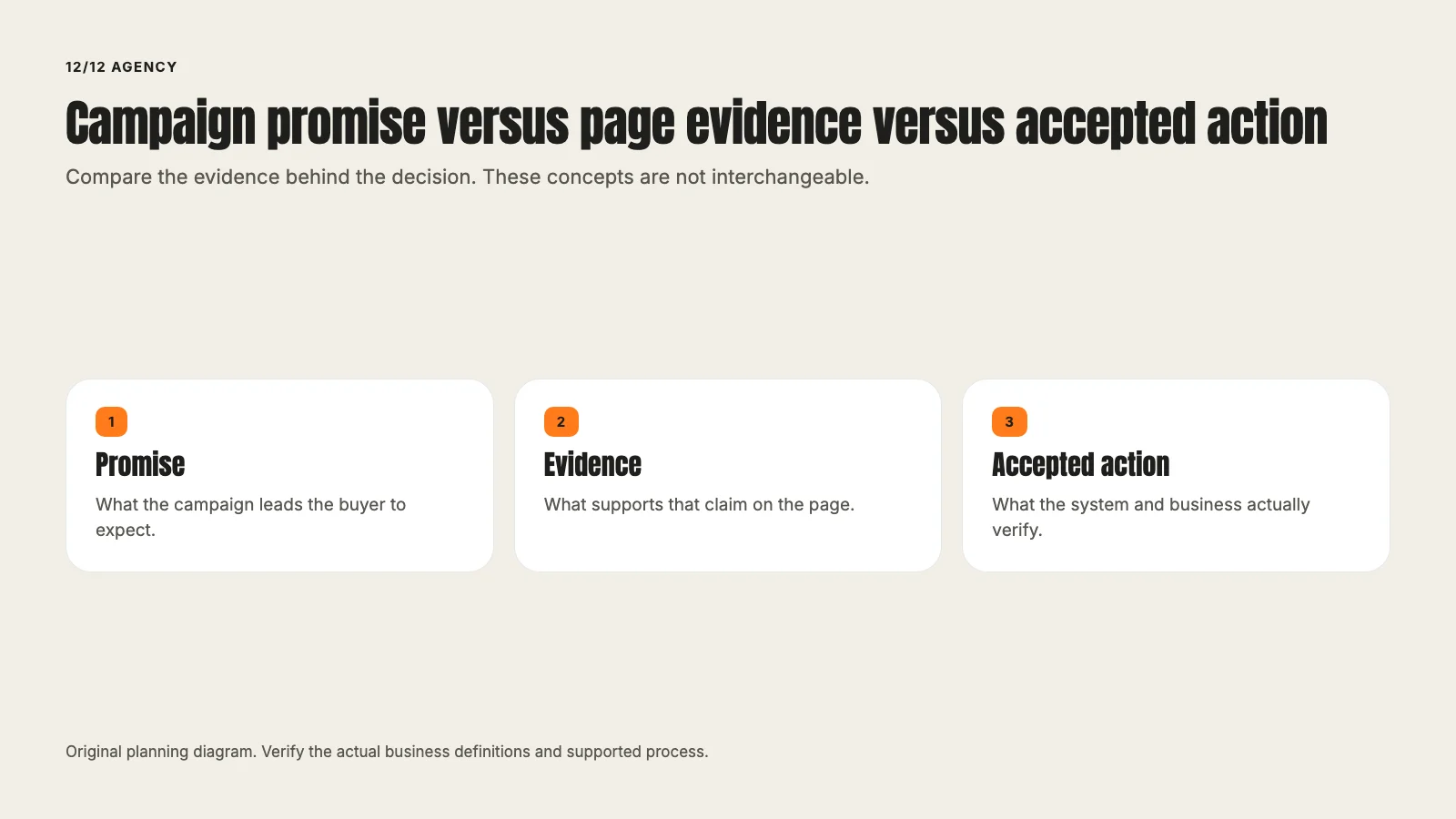
Inspect a campaign page through message, evidence, form states and the business handoff. Separate visible design, technical receipt and a verified outcome.
A landing-page review should end with a clear next job. A score out of one hundred does not help if the business still cannot tell whether the promise is accurate, the form works or the request reaches the right team.
Review the entire path from the campaign to the accepted action. Distinguish a reproducible defect from an uncertain alternative that may need a test. This guide provides a manual review method, not an automated scan or a guaranteed conversion lift.
Write down the promise before opening the page
Record the campaign, audience question and next action. A search ad about repair, a social demonstration and a resource-download offer can create different expectations. The destination should continue the actual promise.
The Google Ads service and Meta service supply different channel contexts. A SaaS buyer and a contractor prospect may need different evidence even when both pages use a form.
Do not begin by copying a competitor's layout. First ask what this buyer needs to understand and what the business can truthfully support. A familiar design pattern cannot make an unsupported offer accurate.
Check the first useful explanation
Can the visitor identify the product or service, its fit and the next step? A headline should describe the job clearly enough that the supporting copy can add detail rather than repair ambiguity.
Read the first screen without relying on the campaign brief. The visitor does not have access to the team's internal explanation. If the page requires a call to discover basic service boundaries, those facts may belong on the page.
Avoid treating shorter copy as automatically better. A complex decision can need a longer explanation. The test is whether the content helps the reader decide, not whether it fits an arbitrary number of lines.
Verify the evidence beside the claim
A product demonstration should show a supported workflow. A project image should represent approved real work or be labeled as illustrative. A customer result needs a verified definition, period and permission.
Do not infer capability from a stock image or turn a concept mockup into a live-feature claim. The reviewer should ask what a reasonable visitor could infer from the combination of headline, visual and caption.
Google's destination requirements are a primary reference for a supported advertising destination. The business also needs its own factual, legal and product review where the offer requires it.
Make the next action understandable
A request, booking, purchase and download are different commitments. The button should describe the actual next step. If a team reviews requests before confirming a time, do not label the action as an instant appointment.
Explain what information is needed and what happens afterward. Avoid invented urgency, availability or prices. A general contact form should not silently become a sensitive application process because more fields can be added.
Use a clear route for the intended action. Multiple choices can be useful when they reflect real jobs, but an unrelated set of competing buttons can leave the visitor unsure what the page is for.
Review the complete form states
Check the empty form, entered form, validation errors, submitting state, failure and successful acceptance. A screenshot of the initial page proves none of the later states.
The web.dev accessibility guidance provides a primary reference for usable form semantics and operation. Labels, focus, error identification and keyboard access belong in the review, not as a final decorative check.
Ask whether each field supports fulfillment or routing. A field the team never uses may add friction without improving fit. Required inputs should remain visible and understandable on small screens and with the keyboard open.
Inspect the confirmation and business handoff
After acceptance, what does the person see and what does the team receive? A success message, event request, notification and CRM record prove different steps. A calendar open is not a confirmed booking.
The conversion-tracking guide explains the broader contract. Verify the actual event, source information and receiving record under the site's normal consent behavior. Do not force permissions or assume that a clean URL certifies attribution.
A live test can create real notifications or appointments. Agree on the labeled identity and consequence first. Preserve the test and exclude it from business counts rather than deleting it quietly afterward.
Review mobile as a decision journey
Read the page on the supported small screen. Can the person understand the evidence, operate the form and recover from an error? Does a sticky element cover essential text, consent controls or the submit action?
Inspect the page after navigation and after opening the keyboard. A desktop layout compressed to a narrow width may still create a different practical problem. Long labels, dropdowns and error messages need their own states.
If performance is a concern, measure the relevant behavior rather than guessing from a screenshot. A lab score and real-user experience are different evidence. Preserve the essential explanation while addressing the actual bottleneck.
Follow campaign context through the route
A campaign can land correctly and lose source parameters at the next link or form. Check the supported path from the actual source page, including intermediate destinations.
Preserve existing destination settings and the agreed marketing parameters without introducing personal data into URLs. The technical implementation should identify which keys are allowed and how conflicts are handled.
Report the narrow result: navigation preserved the parameter, the accepted action occurred, the technical event fired or the CRM stored the intended source. Do not combine those into paid attribution without the actual eligible credited result.
Separate repair from experiment
An inaccurate claim, broken form or missing confirmation needs a correction with an acceptance check. An uncertain choice between two accurate explanations may need a planned comparison.
For an experiment, define the eligible population, primary outcome, guardrails, allocation and stopping rule. A small descriptive difference is not automatically statistically meaningful. If the traffic cannot answer the question, a usability review or narrower test may be more appropriate.
The existing Google Ads audit guide can help connect a page observation to account goals. Do not use a page change to conceal a conversion-definition problem in the campaign.
Produce a useful review record
For each observation, record the page element, evidence, consequence, proposed change, responsible person and verification. Separate known defects, factual corrections and hypotheses.
A fictional review might identify an unclear supported-service boundary, a missing mobile error message and an unverified booking event. Those are three distinct jobs. A single low page score would obscure the work needed to fix them.
Keep future routes and tools as production notes until implemented. A useful draft should not ship broken links to pages that exist only in a planning inventory.
Review the page as a sequence of states
Keep a simple state record: arriving from the campaign, understanding the offer, entering information, correcting an error, submitting, receiving confirmation and reaching the business handoff. Attach the actual evidence for each state that was checked.
This prevents the first-screen design from standing in for the whole experience. It also makes fixes narrower. An unclear headline, a failed validation message and a missing booking event have different causes and reviewers.
The next acceptance check should target the affected state while confirming the complete path still works. A local design approval is useful preparation, but the report should preserve the distinction between proposed appearance and verified behavior.
Bring the campaign promise and destination to a page review.
Frequently asked questions
Want this run for your business?
Tell us where to send it and we'll follow up with the strategies that fit your market.